Chelsee Collins
Graphic Design
Sugartown, LA


Artist Statement
Surely many of those reading this statement have heard the controversial question of “Is graphic design really art?” Some argue it relies too much on communication and problem solving, as opposed to the creator’s instinct. That it is too goal oriented, too objective, too comprehensive. But why can’t graphic design be these and still art? Today, my hope is that as you look at my work, you recognize the artistic capacity of each piece. Heavy use of typography, hierarchy, and clean layouts display decisions made after a wash of inspiration. Art has been used for centuries as a communication technique and graphic design is no exception. Communicating to a mass audience in this way requires some insight into what the piece will look like to an outsider. My work draws the viewer in from a distance, and once closer they can appreciate the intricate details. To do this, I usually use a bold or more unique font that stands out to establish the focus of the piece. Then, follow through with a simple typeface to simplify things and help the viewer navigate the work easier. I strive to include some sort of hand-drawn element to all the works, as long as it fits the project’s appeal. This can add some character and a bit of a personal touch to prevent anything from feeling stale. The combination of typography and graphics creates a sweet spot of fulfilling the purpose while still being interesting.
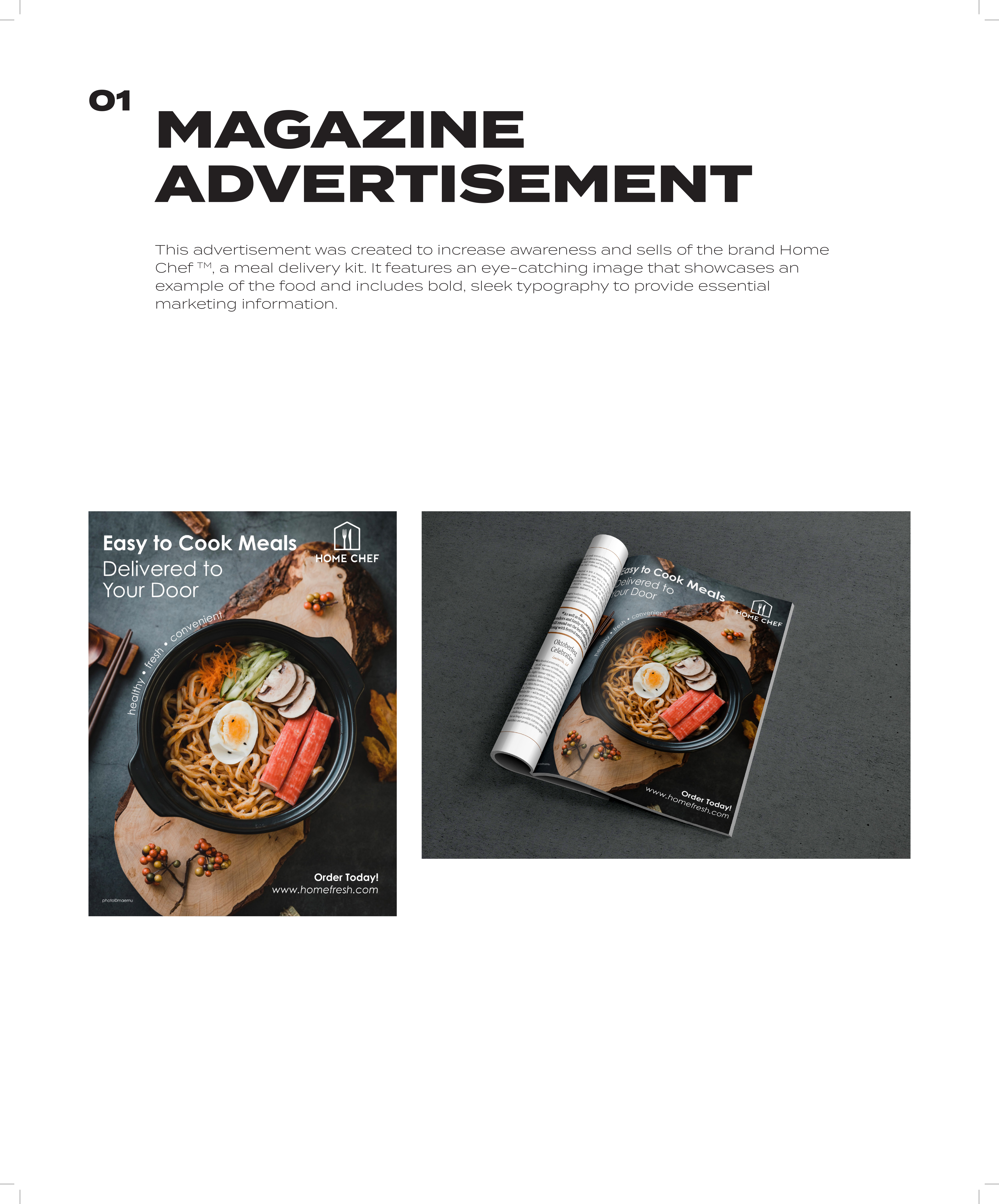
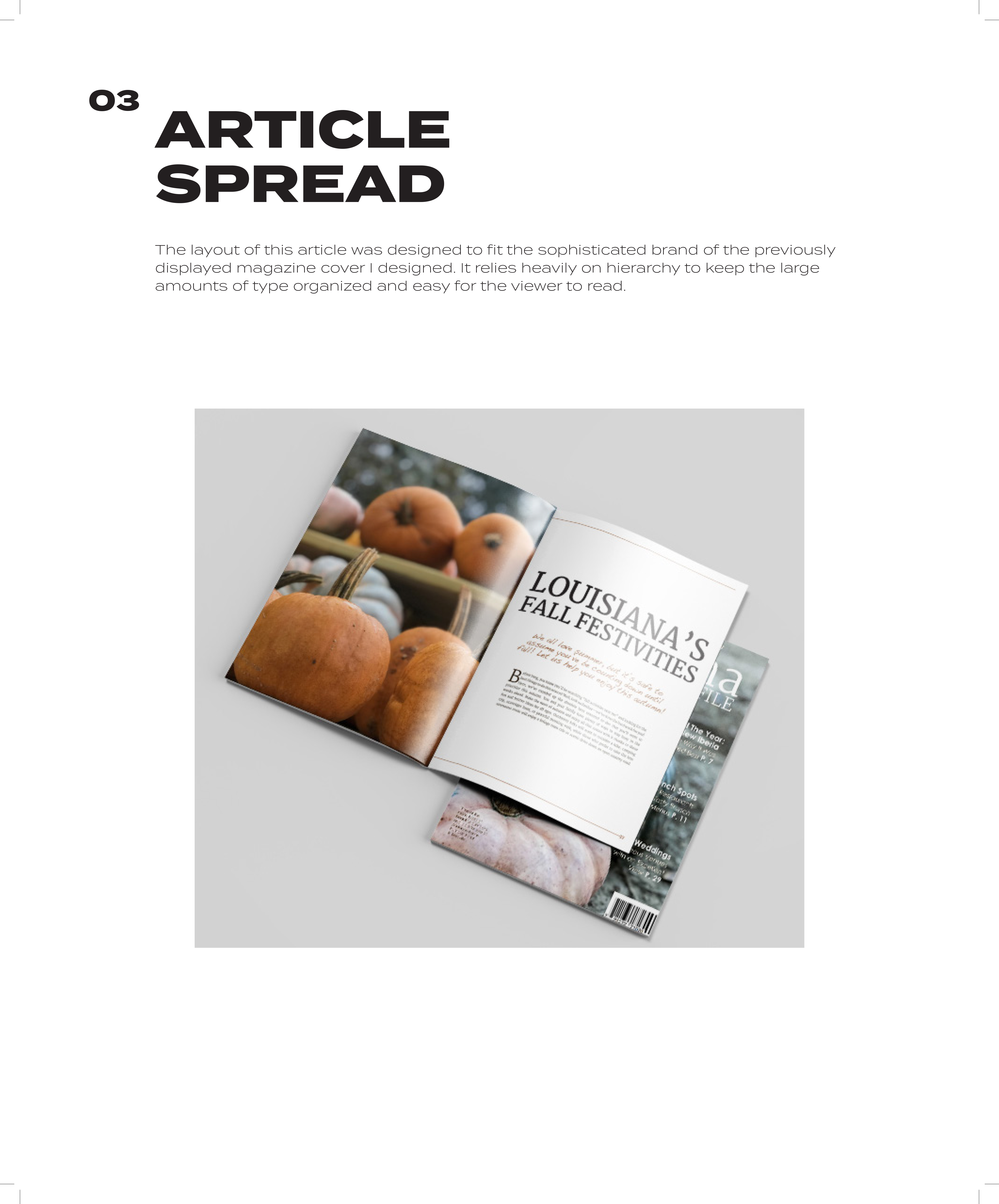
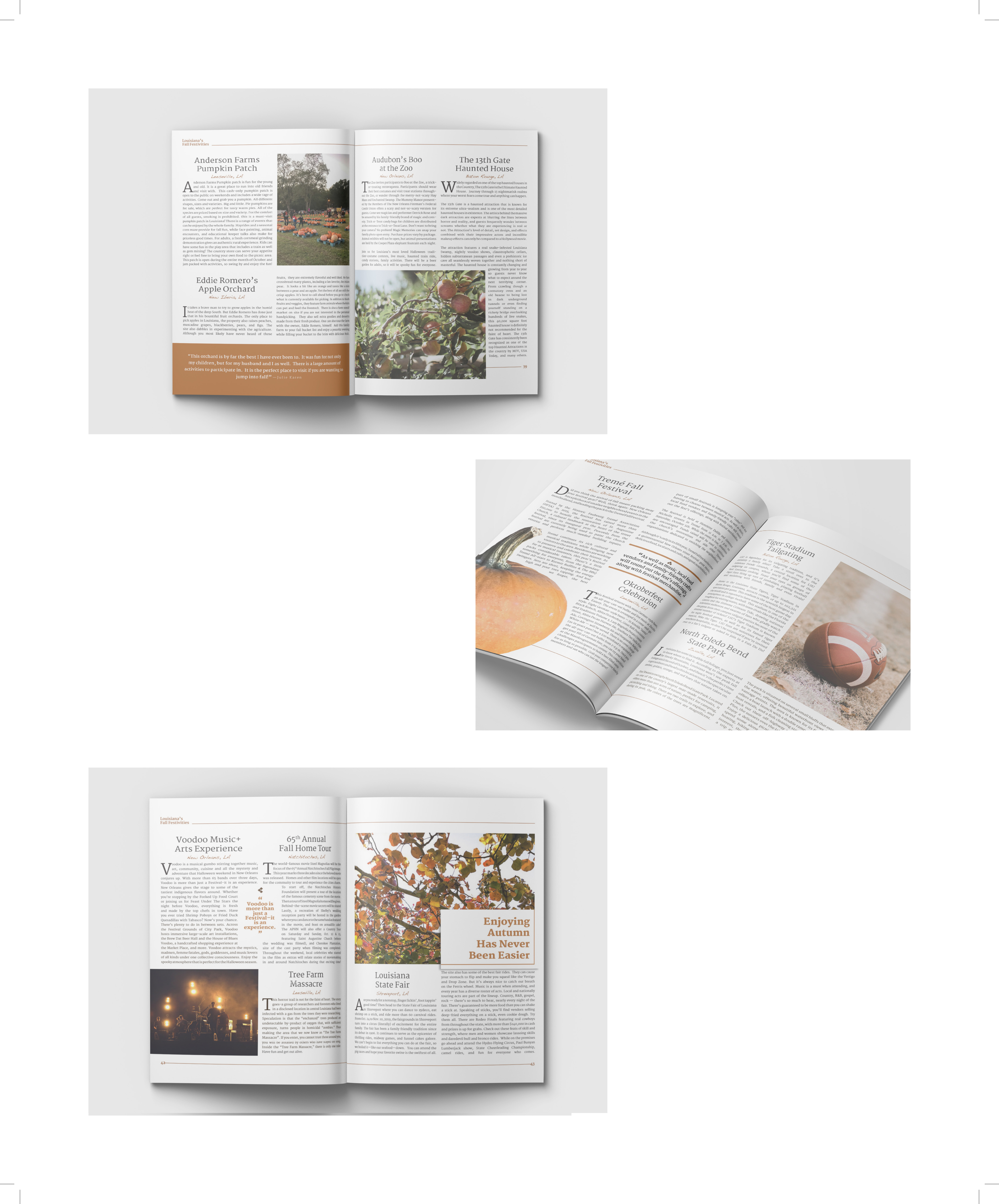
I enjoy logos, posters, and other forms of design, but a large portion of my work is projects that have multiple pieces to consider, such as the book trio and the magazine spread. I relish the challenge of having to figure out how to give each piece their own personality, while still clearly working together as a unit. The viewer has to look at this work and see them as a collaboration, but also be content with the pieces in a solo setting. For this to be achieved, a great deal of thought and creativity is applied to every aspect. Although the larger collateral pieces take a level of creativity to uniform the individuals, single item projects have their own thought-provoking challenges. These solo pieces require the artist to take a broad concept and scale it all to fit on one single page. It is important to capture everything this event or product is about in a way that perfectly fits what is being displayed. I enjoy establishing the underlying theme of each piece and then highlighting what this represents and how it is unique to only this project. This is what the audience first sees. It draws them in and causes them to determine if this is something they would be interested in, primarily based on how I arrange the work to speak to them. Each piece has to be formatted through text and visuals to display the specific essence of the subject matter. For example, a children’s book signing would be advertised differently than a formal fundraiser. And on a smaller note, one brand’s product should have a different visual character than that of another. They communicate differently to the audience and it sets them apart from each other in a consumer setting. An individual might be drawn in based solely on how the displayed persona of the item speaks to them. My primary goal is to exploit and magnify that personality in each piece so that the viewer can identify this essence of whatever is being designed.